The Atlanta Hawks unveiled their new uniforms before the media and season ticket holders at Philips Arena on Tuesday.
While they have many fans for the Nike-inspired, Oregon Ducks-inspired uniforms that are meant to attract the new millennials were mocked by a large pocket of the social media platform.
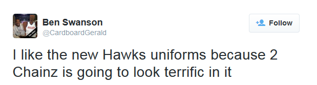
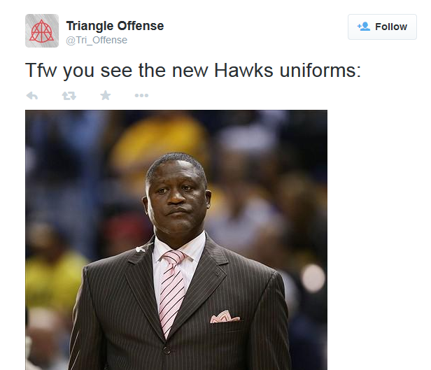
Take a look at the responses:
I don’t follow basketball too much, but I think the #AtlantaHawks‘ new logo looks like Pac-Man is finally getting off his diet.
— Elliott (@MechanisticMoth) June 25, 2015
I hate this fad stuff with unis. In college fine but the pros? ATL Hawks will alter these in three years and change within 5 #AtlantaHawks
— Richmond Tweh (@RichmondTweh) June 25, 2015
Atlanta Sea-Hawks? Team brings on the neon with new uniforms for next season https://t.co/zWn91fSlpp pic.twitter.com/vIfzNhXjqH
— Bleacher Report (@BleacherReport) June 24, 2015
Why do the new Atlanta Hawks uniforms look like David Ortiz’s batting gloves???
— Randeezy (@pamsson) June 24, 2015
You know what’s sad? These new Atlanta Hawks jerseys are still better than the new Los Angeles Clippers jerseys! https://t.co/WcPSxVqLT8
— Justin Russo (@FlyByKnite) June 24, 2015